top of page

1/1

1/2


1/2

1/1


1/2

1/1

1/1

1/1


1/5
1/1


IF ONLY CREATIVE
August 2023
Branding
Web Design
Presentation Deck
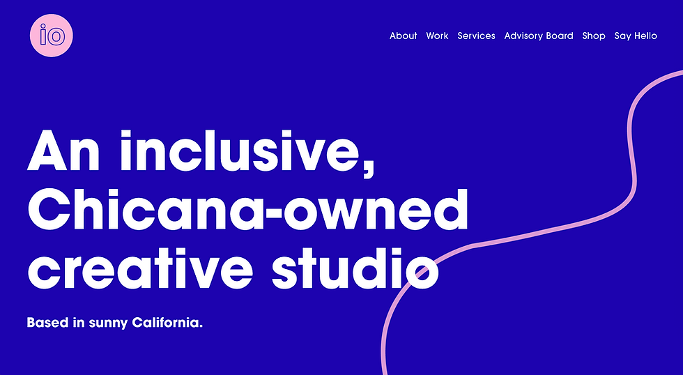
The studio is a digital marketing studio and the objective was to build upon their logo and create a cohesive brand for their studio.
The original 2 brand colors, blue and pink, were chosen to reflect the fun and vibrant work of the studio. I chose to keep the current colors, making sure to choose a shade of blue that reflected the digital nature of the studio's work. The color palette expanded upon the lively brand persona: unapologetic, fun, and women of color owned.
The squiggles were incorporated as a design element, as requested by the studio owner. They were a part of a mural in the studio's physical space. We agreed that they could be used to reflect the lighthearted and unconventional environment.
We also incorporated a disco ball as the cursor for the website as another little Easter egg, as they have a disco ball in their studio space.
The studio also prides themselves in creating community and events that connect their clients with their customers/audiences. The squiggles and wiggly lines compliment that sentiment of creating connections and bringing people together in exciting and silly ways.

bottom of page